
GIS is a software that helps users create interactive smart maps that visualize spatial information and help make better and wiser business decisions that are important for the organization of work. Sometimes you can’t read your data and visualize it at the same time. GIS is the right solution to help you achieve that ultimate goal, notice and communicate something raw data isn’t able to do.
In this article, we will reveal all you need to know about GIS!
OUTLINE:
- Introduction to GIS
- Use Cases and Examples
- GIS for Public Services
- Disease Mapping
- GIS for Water Utilities
- GIS for Electric Utilities
- GIS For Landslide Mapping and Safe Construction Planning
- Empowering People With Disabilities Using GIS
- GIS for Vegetation Management
- GIS for Local Government
- GIS for NGOs and Nonprofits
- GIS and Archeology
- South Pole Expedition Powered by GIS
- The Evolution of GIS Mapping
- Mapping Techniques
- Map Types
- Desktop and Online Mapping Software
Whether you are new to GIS or already an expert, through this blog, we will address the importance and implementation of GIS solutions throughout numerous industries and point out the benefits that GIS offers.
Introduction to GIS
To start things off here is one of many definitions – Geographic Information System is a software tool that analyzes, stores, manipulates and visualizes geographic information.
GIS originated not only to collect and visualize data but to draw conclusions and take action based on spatial analysis. These actions can vary from useful public and social services to complex business decisions. As such, GIS is a crucial solution for managing space, organizations, communities, cities and countries.
To break it down, GIS allows you to:
- Create or import spatial and geographic data
- Organize and manage data
- Analyze data
- Visualize and display the data on a map
All this makes a big difference in your business workflow and decision making for your field teams and office managers. Let’s keep in mind that every GIS specialist has a definition, depending on why and how they use GIS solutions. That being said, you don’t need to be a GIS expert to use GIS technology. Many people even use GIS without being aware of it. It is indispensable in the management of business organizations, cities and countries. It allows you to answer questions about spatial data related to a particular location.
In this article, we will explore examples and use cases of GIS mapping to help you better understand and appreciate this versatile software.
Each day, countless decisions in various fields are empowered by GIS and spatial thinking. Since everything occurs in a specific location, all of these “geographic” problems require spatial reasoning and spatial analysis. That’s where GIS steps in. With just a few tricks, it can do all the work for you. The motto is – work smarter, not harder!
Thanks to GIS you can connect attribute data (the equivalent of columns in Excel) with their geographic location (coordinates, longitude and latitude), therefore bringing scattered pieces of information to life and understanding the key parameters of your spatial data visualizing it on a map. Performing analysis of georeferenced data makes it easier to process presented information and extract what is relevant for your workflow. This includes everything, from field data collection and inspection to monitoring project progress from the office and creating maps in real-time.
Many online GIS solutions enable easy collaboration and simultaneous work on data, maps and team organization.
Use cases and examples
So, who uses GIS?
Nowadays, almost all industries are using a particular form of GIS software. It can be implemented by individuals, small or huge companies, communities (states and cities), research institutions, environmental scientists, health organizations, land-use planners, businesses, government agencies, education centres… well pretty much anyone!
If your data is connected to specific locations, you have enough material for a map. GIS can do so much, but long story short, it helps you to create maps and maps are pretty amazing. They’re informative and fun, and when done right, they provide a simple and practical understanding of physical space and what happens in it. In case you still wonder if you need GIS software and if visually representing attribute data is beneficial for your business, you might find this blog post very helpful.
There are many uses of GIS. We would like to start things off with a widely used web-based mapping solution people use for navigation daily, the Google Maps. There are many other such navigation apps available online, but we are pretty sure you heard of this one. GIS also helps in dealing with transportation issues, infrastructure assessment, network and telecom services, electricity and natural resources management and maintenance, geologic and agricultural applications, community development and urban planning, accidents and hot spot analysis, environmental impact analysis, surveying, crowdsourcing… we could go on, but let’s instead show some examples.
Throughout the years, we at GIS Cloud have gathered experience and exciting case studies that explain how versatile GIS solutions are.
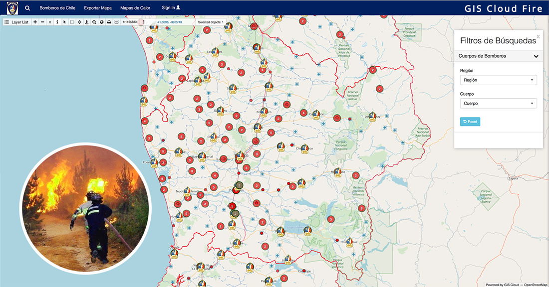
GIS for Public Services – Fire Departments
In 2017, when the firefighters of Chile were facing massive fires across the country, they decided to implement our dynamic GIS solution for strategic planning and fieldwork coordination. They integrated real-time information on the closest active firefighters and the location of equipment available to them to provide the best possible service to their community. They were voted the most trusted brand in the country.
In this project, GIS mapping improved their internal processes and increased efficiency.
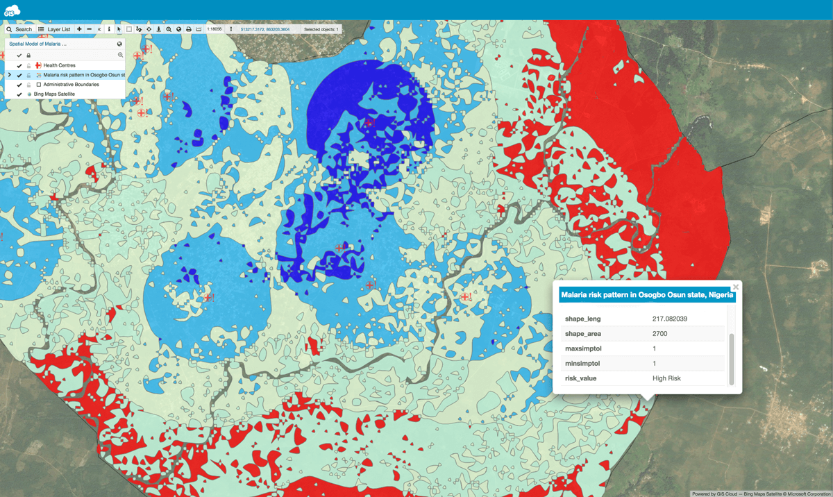
Disease Mapping – Combating Malaria With GIS
The next case study is based on the project “Geospatial modelling of malaria risk areas and vulnerability (severity) using environmental, climatic and socio-economic factors“. This demonstrates how to use GIS technology for solving global health problems, like the malaria epidemic. The project was developed to help people and communities find out about malaria risk areas. With the help of the Internet and SMS for people with a poor internet connection, an interactive malaria risk map was generated. Volunteers created a dashboard for intervention programs, so they can know where, when, and what type of intervention is needed.
“The relevance of GIS for public health, in this case, cannot be overemphasized because it provides us with the ability to conceptualize and visualize public health data while having a tool for us to understand the spatial trends and patterns of diseases and epidemics.”
Ayodele Adeyemo
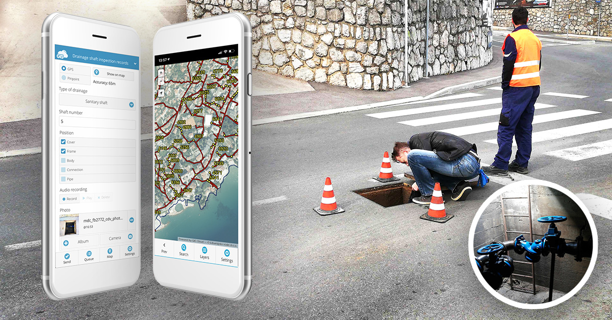
GIS for Water Utilities
The implementation of field inspection via surveys on mobile phones has a significant impact on water utility companies and their general workflow. Digital Transformation Of Field Operations In A Water Utility Company Using GIS Cloud helped increase their workflow. This water utility company digitized all of their data and made it accessible online in the cloud. They organized everyday data collection with mobile data collection app. This improved the process of field data collection and infrastructure data management, utilizing multi-level collaboration with local governments and public sectors. Companies increased their data accuracy and reduced the job timeframe by eliminating paper forms.
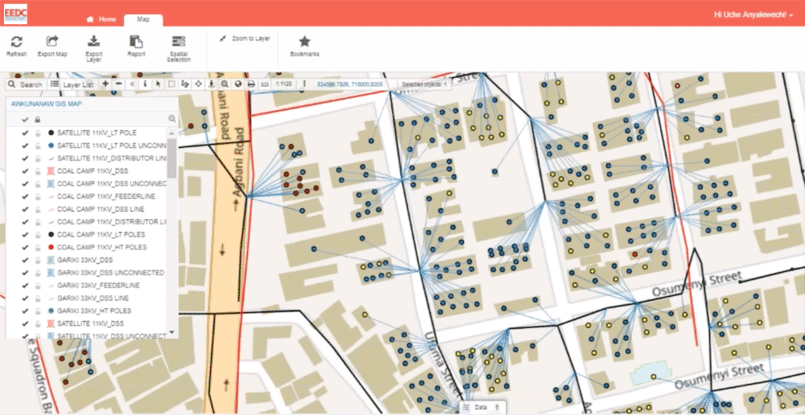
GIS for Electric Utilities
GIS software has been empowering the electric utility industry for decades. It provides a robust framework for asset and workforce management as well as tools for planning and analysis. Today, the landscape is filled with desktop solutions like those from ESRI, open-source software like QGIS, but also a host of online GIS solutions. Fighting electricity theft in Nigeria (Africa) is an interesting case that helps a local company fight crime embracing GIS Cloud technology. They utilized the GIS solution for each part of the workflow, including efficient data collection in real-time, visualizing and monitoring results as well as communicating feedback, and sharing data to the stakeholders for decision making. If you wish to learn more about the uses of GIS for Electric Utilities read this article with examples.
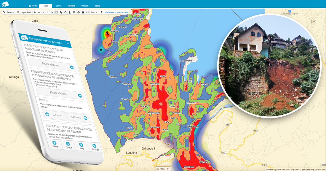
GIS for Landslide Mapping and Safe Construction Planning
Landslides are a severe problem in some regions of the world. They cause significant socio-economic difficulties and have a high impact on people’s lives. How can mapping landslides with GIS solutions help reduce people’s vulnerability living in habitats susceptible to natural disasters? This case study on safe housing and construction shows the benefits of using GIS to create a heatmap of landslides in the Kivu Region of DR Kongo. Landslides in this region took over 130 lives, destroyed 700 houses and 4 schools. Heatmap makes it possible to see the spatial analysis of the vulnerability, hazards and public perception of landslide risks. The most important is that these results enable safe construction and housing which helps to save human lives.
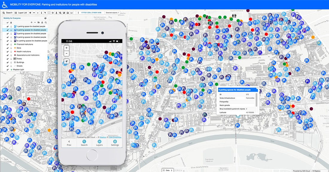
Empowering People With Disabilities Using GIS
The noteworthy project, started by geography students from the City of Zagreb called ‘Mobility for everyone,’ recognized the importance of mapping handicap parking and other assets to improve the mobility of people with disabilities. They focused on mapping the city infrastructure that helps people with disabilities, resulting in a publicly accessible map portal. Students collected the required data using the Mobile Data Collection app. Organized and edited information was released to the public through our Map Portal. With this custom GIS app, people with disabilities can now plan their activities and routes around the city faster and more efficiently.
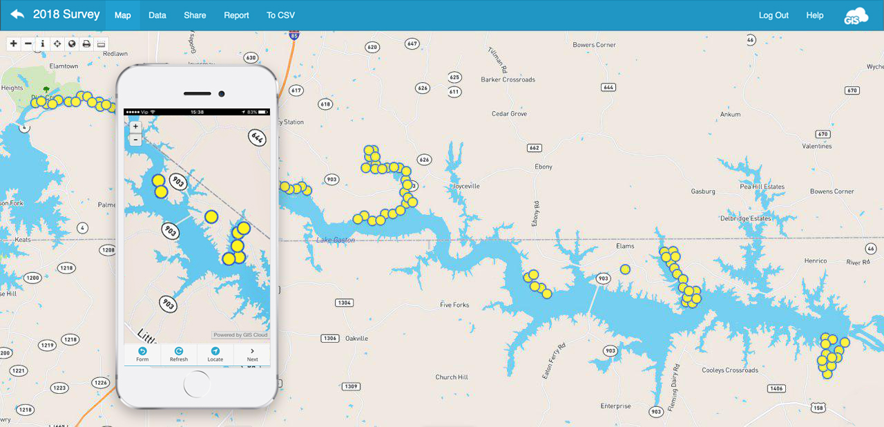
GIS for Vegetation Management
An excellent example of volunteers working on vegetation management for an entire lake Gaston shoreline, between Virginia and North Carolina, shows that GIS is an essential tool in ecology research and vegetation maintenance. The shore was threatened by invasive plants spreading out of control. Therefore, a vegetation survey was required to determine the best way to fight invasive flora. Primarily, the LGA (Lake Gaston Association) GIS vegetation and shoreline survey program combines research, monitoring and communication that keeps the LGA informed and maintains rapport with all appropriate groups involved in the decision-making process for each environmental issue in this area.
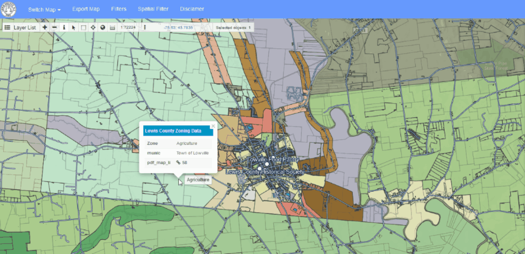
GIS for Local Government – Create an Open City Map Portal With GIS
Many, local governments, smart cities and city agencies have enabled the public to access spatial and nonspatial information through GIS solutions like Map Portal – a custom GIS app. With GIS, cities, counties, and even states can manage their data better throughout departments to lower the costs of administration and dispose of their budget more efficiently.
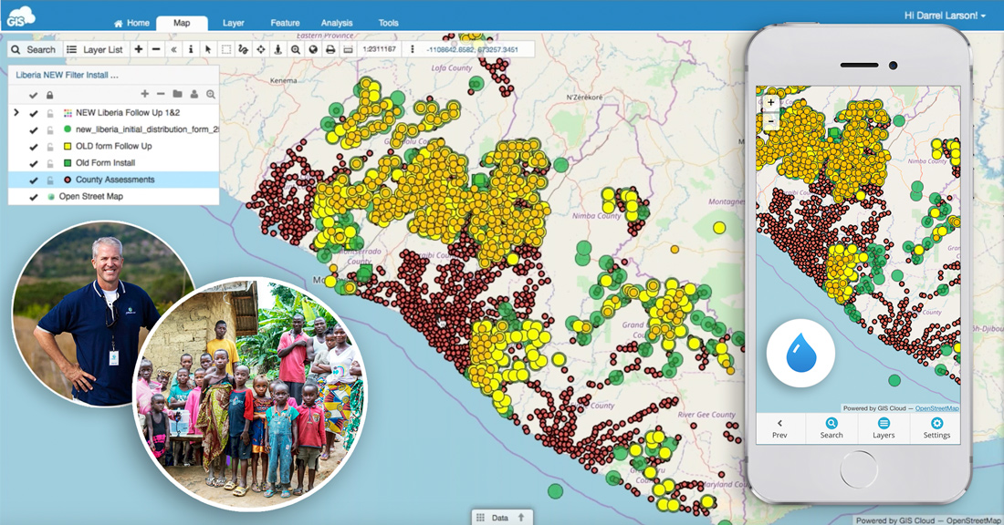
GIS for NGOs and Nonprofits
Nonprofits and NGOs face many common challenges when trying to promote and achieve sustainability, equality or develop smart solutions for various causes, from finding funds, time and resources, to living up to the project’s expectations. Online mapping solutions for NGOs like GIS Cloud can help alleviate and address many of these challenges like assessing water resources in Liberia. Nonprofits there joined forces to map the entire country and reach a common goal: bring clean drinking water to every Liberian household by December of 2020. They located and mapped water resources and then tracked the installation of water filters using the Mobile Data Collection app. This resulted in a 95% reduction in symptoms for water-borne illness.
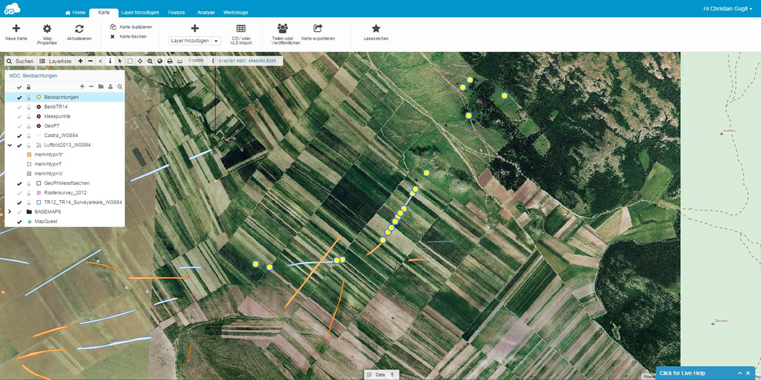
GIS and Archeology
A case study that demonstrates how using online GIS solutions helps achieve project goals even in remote areas with low or no internet connectivity. A successful field data collection solution enabled a complex archaeological survey. Dr. Gugl at the Institute for the Study of Ancient Culture in Austria said that this solution satisfies all of the prerequisites for their project to be effective and accurate. They used GIS Cloud in their research of Roman Military Camp – Municipium – Late Antique and Byzantine Fortification. From the archaeologist’s point of view, GIS has simplified not only their data collection and visualization but also the perception of space itself, considering that the spatial dimension of archaeological research is essential.
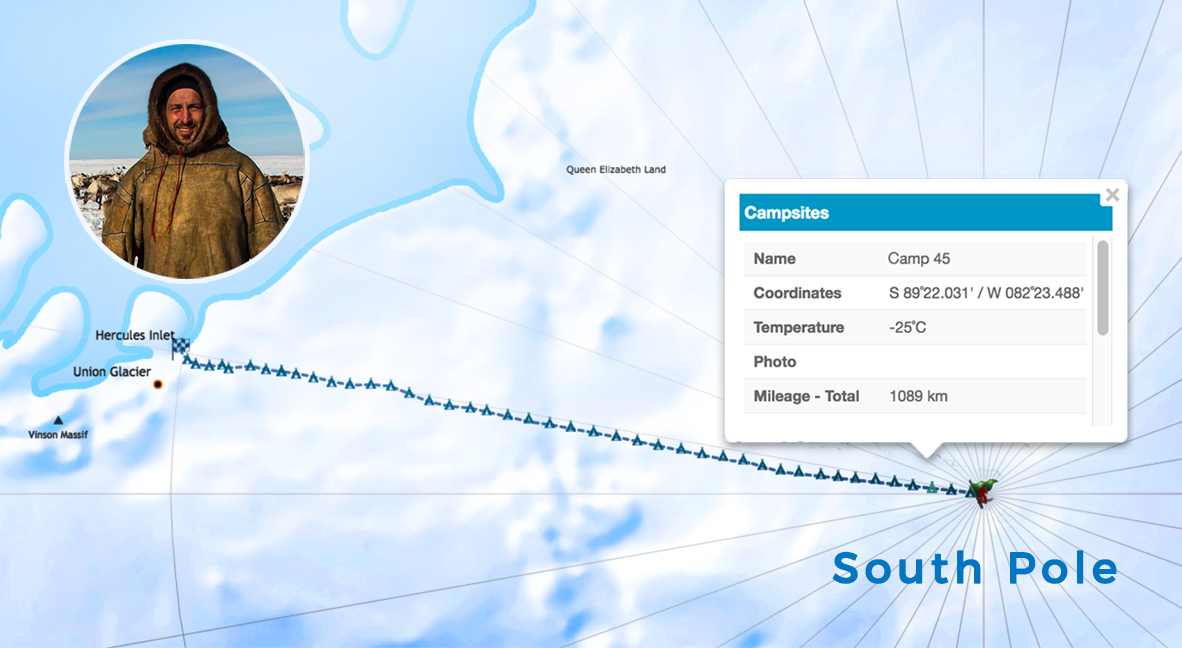
Conquering the South Pole – Expedition Powered by GIS
We are really proud to be a part of the great Croatian South Pole expedition mapping project! Renowned Croatian adventurer Davor Rostuhar completed his South Pole journey on foot in January of 2018. The expedition was tracked from the Antarctic shores to the South Pole, covering the whole distance of 1200 km, that Davor courageously passed solo, unsupported and unassisted in 47 days. His endeavor was followed and supported directly from our office in Croatia’s capital, Zagreb, and we were thrilled to track the daily progress of this fantastic polar expedition.
All of the mentioned cases used online GIS solutions that can be integrated with desktop GIS solutions. This way, all project participants have been able to bridge the gap between the desktop and the cloud to collaborate between teams and display the data in real-time. This helped with important decision making!
The Evolution of GIS Mapping
GIS mapping is not as revolutionary as you may think. Fascination and interest with exploration and maps have been inherent to human nature since prehistoric times. Looking back (way back), the practice of capturing the world and drawing maps by hand were originally merely artistic, but through time their value turned them into scientific disciplines.
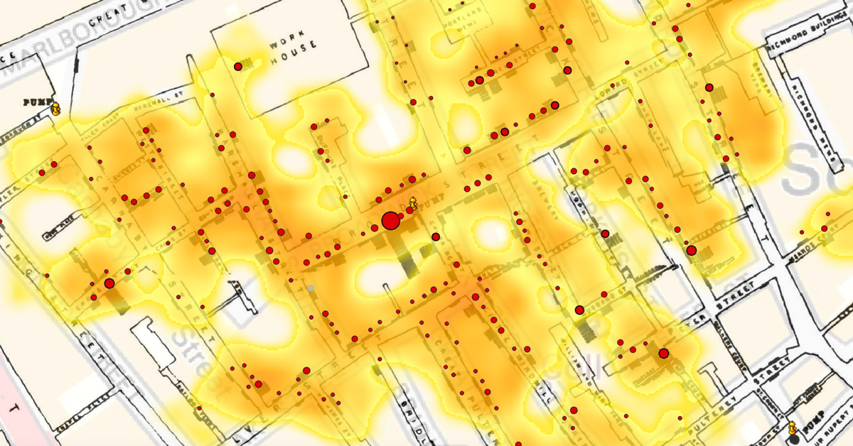
We have to mention one of the best known early applications of location Intelligence by an English physician named Jon Snow (not the popular Game of Thrones character). His map of cholera outbreaks in London from 1854. recorded cases of cholera and discovered that a vast majority was concentrated around specific water pumps. By identifying the source, people were able to take action. This was regarded as the founding event of epidemiology but also a great example of spatial analysis and the very beginning of GIS.
Talking about the evolution of mapping, first thing geography enthusiasts among you will probably think of is cartography and land surveying. Both are very closely connected to GIS. The key difference between cartography and GIS is that cartography deals with representation, while GIS is concerned with the analysis of spatial relationships.
Basically, GIS represents a blend of digital cartography including database management, computer science and geography, along with some other disciplines. Its evolution was boosted by a technology growth in the mid 20th century making it a relatively new field originating in the 1960s. Within the last five decades, GIS evolved from a concept to this robust platform that keeps growing and changing the way we implement spatial information in our decision-making processes. Today, thousands of organizations from all kinds of fields keep creating and sharing their stories through interactive maps and visualizations.
Mapping techniques
GIS is interdisciplinary. It studies data structures and computational techniques to capture, represent, process, and analyze geographic information. GIS is a system that transforms the way an organization works. It can significantly improve the performance of an organization by analyzing and implementing spatial analysis and visualization of data into its workflow.
Let’s get more technical as we go through some terms and tools that GIS offers! Of course, there is a lot of interesting literature available on GIS, but if you are an enthusiast like us, we suggest that you explore the world of GIS starting with this particular Geo-portal.
GIS data represents real objects (roads, land use, elevation, trees, waterways, etc.) whose representation can be divided into two abstractions: discrete objects (e.g., a house) and continuous fields (e.g. elevations). Methods that are used to store data in GIS for both kinds of abstractions mapping references are vector models and raster images.
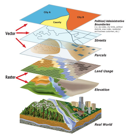
Raster vs Vector; image source: https://guides.lib.uw.edu
For example, the vector data model represents geography as collections of points, lines, and polygons (each component is referred to as a ‘feature’). The raster data model represents geography as cell matrices that store numeric values and TIN – an alternative to the raster data model for representing continuous surface as the sets of contiguous, non-overlapping triangles. In GIS, these models store information about the real world as thematic layers. Layers are positioned and linked according to their geographic coordinates and stacked on top of each other. As a result, adequate groups of data are easily gathered and managed. This way, robust spatial analysis can be performed more accurately and with ease.
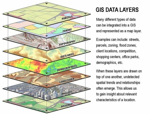
Image source: https://sectionhiker.com
You can analyze and compare terrains and datasets quite easily. The map you see is a simplified model of the terrain. A grid-based GIS offers some algebraic functions to help you fine-tune a search.
GIS provides a variety of outputs:
- maps
- charts
- 3D diagrams, etc
All of these unique capabilities enable GIS to reveal more profound insights into data, such as patterns, relationships, and situations helping users make smarter decisions. To get a better understanding of all of this geo-lingo, here’s an example.
Let’s start things off with something simple – Basemap. It is a predefined map that forms the background onto which you can add your data and create a new map. For example, you can add a raster image on your basemap which represents the elevation of the terrain. Next, you can add vector layers, like a polygon layer representing the country states, a line layer representing the roads and a point layer representing cities. You can also adjust the size of the points according to the size of the population of each city. You’ve created a map!
With this introduction into the world of GIS mapping, we’ll focus on its everyday use to get a better idea. Since its primary purpose is to produce data visualizations in the form of a map, we’ll mention a few map types.
Map Types
One of the most commonly used GIS map creations in any field is a thematic map, a way to simplify and present raw data to a broader audience. Thematic maps are designed to highlight information on a specific topic. They can symbolize value distributions, processes, phenomena, and patterns in a straightforward way, making them easy to read. Choosing the right type of visualization will profoundly influence the understanding and interpretation done by users. It depends on the data you are working with and the information you wish to communicate to the audience.
Let’s explore some of them:
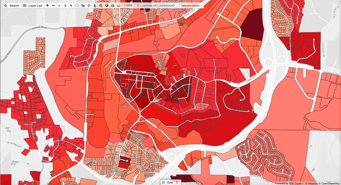
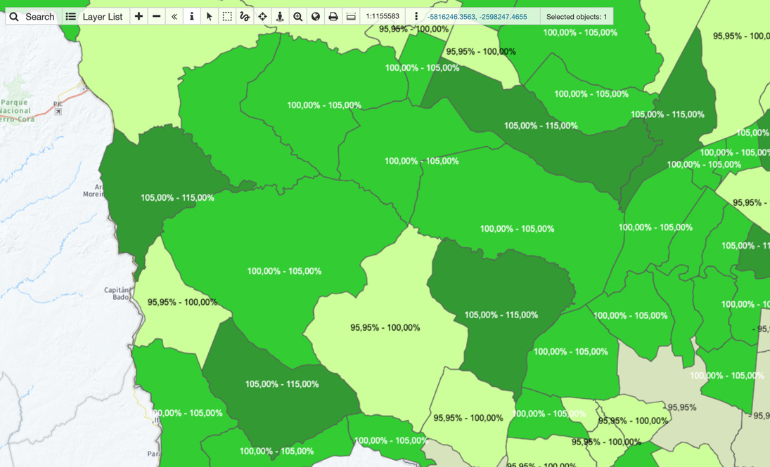
Choropleth map
This is a map that uses differences in shading, coloring, or the placing of symbols within predefined areas to indicate the average values of a particular quantity in those areas. Those areal unit’s statistical variables are being displayed on the map. For example, you could present the population density of a country by its administrative areas, with densely populated areas shown with a darker shade while the less populated areas are shown with a lighter shade. Other examples include per capita income, votes for a specific political party by administrative areas, frequency of bicycle use, criminal activities in certain cities, and many more.
Cartograms
Cartogram is a unique type of map because it combines statistical information with geographic location (such as travel time, population, or GNP) is substituted for land area or distance. The geometry or space of the map is distorted, sometimes immensely, and sacrificed to convey the information of this other variable. A cartogram could, for instance, consist of a choropleth map that has been modified to show the size range of data in a much clearer way.
Heatmaps
A heatmap is a graphical representation of data that uses color-coding showing the density of the values. The primary purpose is to visualize and emphasize the areas that matter the most and represent the message you wish to convey.
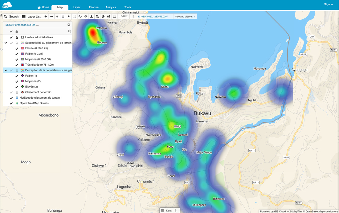
It creates an intensely colored cloud-looking cluster where the points are more densely located. Similar to a cartogram, it uses colour to represent the intensity, and it does not apply geographical or geo-political boundaries to group data.
Graduated Symbol Map
Sometimes called a bubble map, it uses a symbol to represent the data at that specific or aggregate point, which is scaled by value – a more significant symbol represents a higher value. The size of each symbol can be proportional to the value you are visualizing, or you can set 3 to 5 ‘classes’ of values allowing for comparison and classification of locations.
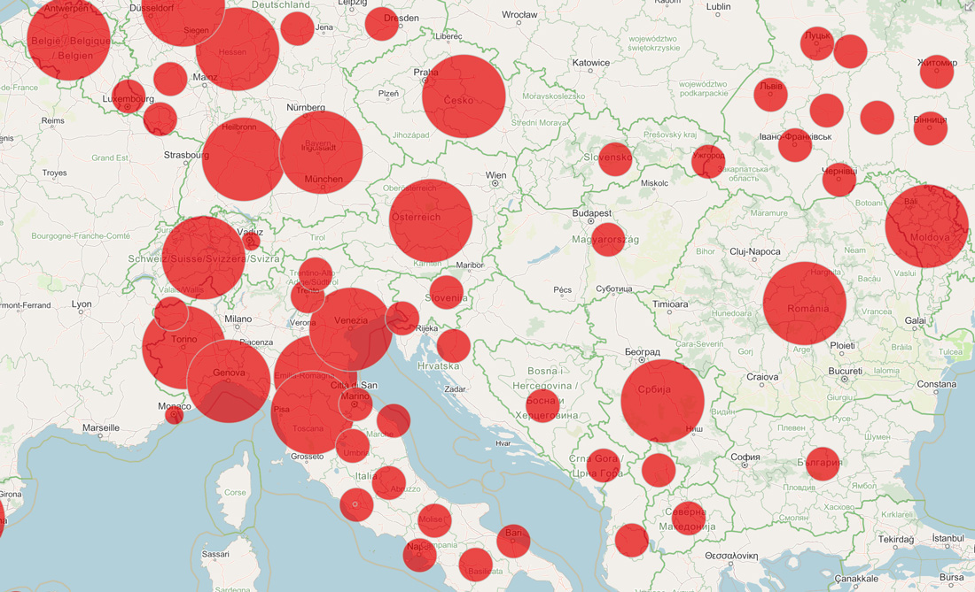
Even though the final product looks quite different, it basically works similar to a choropleth map, but it uses point size instead of color to represent the difference among data.
Dot density map
This one is pretty self-explanatory; it uses point (dot) features to represent your data. In a way, they look like a raw version of a heatmap, showing areas where the dots are densely clustered but without creating an interpolated colored surface.
One of the best-known examples of this type of mapping is the before mentioned map of cholera patients in London by physician John Snow, one of the first examples of location intelligence. He mapped the location of patients dot by dot and realized they are densely located near water pumps which were the source of the disease.
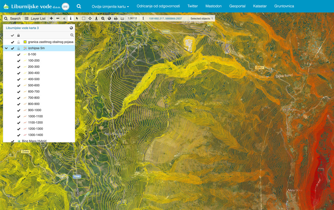
Isoline Maps
If your data focuses on continuity over distance, you might want to consider an isoline map, which uses continuous lines to indicate points of the same value. There are many types of isolines depending on what they represent, and the most famous is a contour line that represents elevation on a map by connecting points of equal height. You must have seen these on topographic maps as they are commonly used to visualize terrain (together with colors).
This was just a simple breakdown of a couple of most commonly used thematic maps but in general, depending on how you categorize your data and which results you wish to represent. There are many variations and combinations of these techniques available. You can even have a few layers of different visualizations inside one map to convey your desired information.
Keep in mind that there are a few cartographic and data visualization rules that must be followed when creating a map (most of them are based on shared knowledge and logic). Other than that, you’re free to explore and work around with the various options the software provides.
Desktop and Online Mapping Software – Unique Benefits
There is a variety of GIS software available out there. So many options and variations don’t seem to differ as much, primarily through the eyes of a rookie. GIS enthusiasts know that the power of GIS lies in its ability to perform analysis, and this is where the GIS software starts to differ. Most desktop GIS solutions include complex analysis and tools invaluable for GIS experts. GIS software is an excellent addition to the workflow of any company. It is a powerful and useful solution that will digitize and improve decision making, and help you understand spatial data better.
However, in recent years, one of the most important benefits of any GIS solution became the possibility to share and collaborate on maps and data in real-time. We have witnessed an increased usage in online GIS solutions such as GIS Cloud, which are user-friendly and easy to learn and can thus empower even non-gis experts.
There is a big advantage in using online GIS solutions, such as real-time data collection, inspection and editing, team and job management. This helps your organization to make faster, better and more accurate decisions, saving time and paperwork. It becomes easy to exchange data and geographical information between users on a different level of permissions, allowing them to participate in projects regardless of their location.
When it comes to pricing, sophisticated desktop GIS software, that is created for GIS specialists and professionals, can be somewhat expensive. If you don’t need all the comprehensive tools they offer it even might be a bit overwhelming. You must have heard of ESRI ArcGIS, one of the leading mapping and spatial analytics software for desktop. GIS Cloud offers a Publisher for ArcMap plugin for transferring your maps and data from ESRI directly to GIS Cloud with just one click. This enables you to make your maps accessible online so you could collaborate on them with your team. This is also a simple and efficient solution for all ESRI users who wish to publish or embed maps and data into their website or blog without needing their own servers.
It is noteworthy to mention there are some great free and open-source solutions like QGIS software. We have also developed a QGIS Publisher plugin that enables you to publish your maps to the GIS Cloud Platform with just a couple of clicks, preserving your symbology. That makes your maps publicly available and ready for collaboration. You can also update and sync your maps to GIS Cloud as you go.
Whether you wish to represent statistical data with an interactive map, collect field data, or perform complex spatial analysis – there is a GIS solution out there for you! The thing is, you’ll have to explore and evaluate these options first before you find the one that suits the needs of your business the best. World of GIS mapping keeps moving forward and grows on a daily basis.
We hope this article provided you with a simple yet interesting insight into the world of Geographic Information Systems. It may inspire you to explore further and take a step forward in improving and simplifying your business process and decision making.
If you need help or any additional information feel free to contact us for details.
Have a Mapful Day!