GIS Cloud API is, and always was, flexible and open for interaction with other frameworks and libraries. D3.js (Data-Driven Documents JS library) is not an exception. Using D3.js we are able to create interactive graphs and consequently better understand the data we are consuming.
With GIS Cloud API and D3.js integration, we created a Map Portal (custom GIS app) that connects best from both of the frameworks.
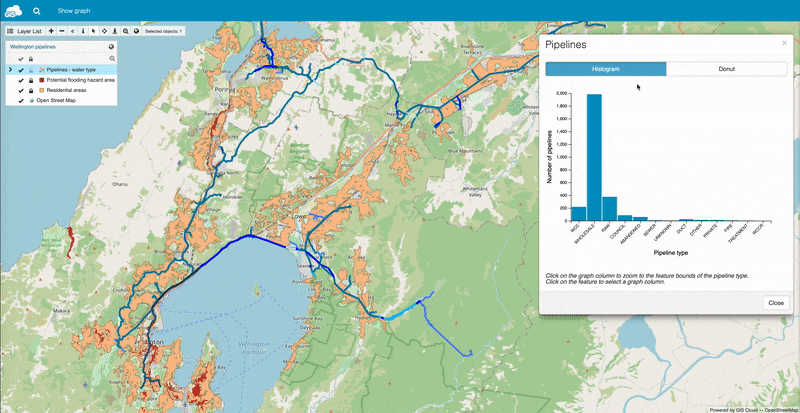
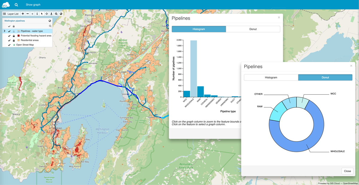
The result is information-rich water pipelines map integrated with two graph types; histogram and donut chart.
How to start building a GIS app with interactive graphs
First, you need to set up your Map Portal app. To be able to do so, you will need to upload data and create a map in GIS Cloud Map Editor, go to the App builder application and build your map portal using created maps.
If you need additional instructions on how to create your own Map Portal take a look at this example or contact us directly.
When your Map Portal is up, your map is populated with data and you are done with the initial portal customization and branding, it’s time to start coding.
Add D3.js library to your Map Portal together with (for now empty) app.js and app.css files.
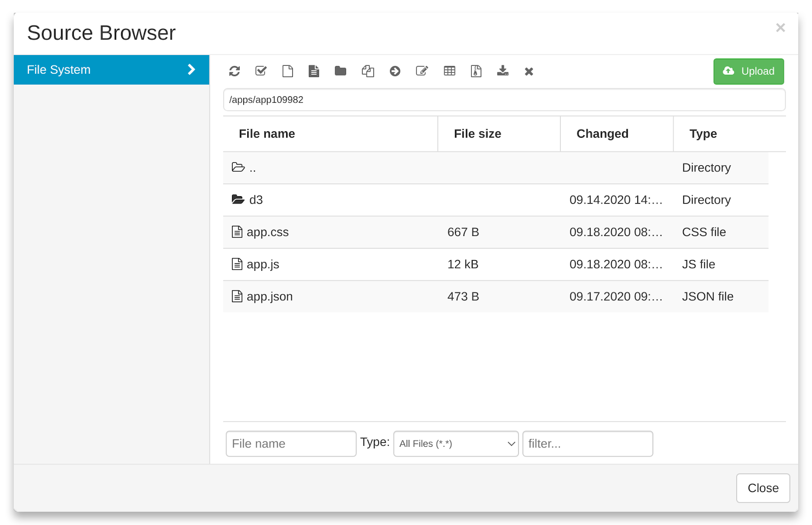
Go to GIS Cloud Manager and open the Apps tab from the Dashboard. Find your Map Portal from the Apps list, click on Edit, open the Advanced tab, scroll down and Open app folder. Upload your D3.js library to the Source Browser.
In the app.json file (which is created automatically once you have opened your portal in the App Builder and saved the changes), we can load all JavaScript and CSS files. For the JS code, set your own namespace. Then, add the first function in app.js that will show a modal window with two graphs.
{
   "responsive": true,
   "scripts": {
       "namespace": "gcd3",
       "init": ["d3/d3.js"],
       "app": ["app.js"]
   },
   "styles": [
       "app.css"
   ],
   "sections": {
       "top": {
           "logo": {},
           "menu": {
               "items": [{
                   "label_i18n": "Show graph",
                   "href": "javascript:;",
                   "onclick": "gcd3.show();"
               }]
           }
       }
   }
}
Understanding The Data
Don’t forget that there is no universal way to visualise the data, on the map or on the graph. First, try to understand the data. Sometimes it can be harder to decide what to do with the data then the rest of the job.
For example, you can visualise your data on the map with different colours, and choose colours that are similar to the project theme. In our example, we decided to go with the blue shades for the types of water pipelines. We used the data for the town of Wellington, New Zealand.
Now we will combine the map and graph visualization to better understand the amount of water pipelines types in the different areas. At the end, we will integrate graphs and GIS Cloud map to achieve the interactive data visualization.
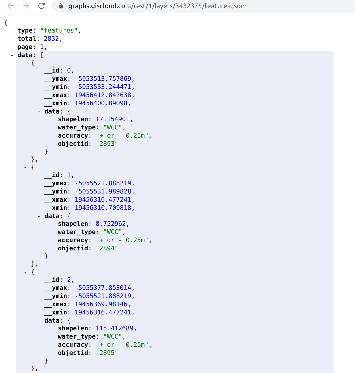
Response for features request in GIS Cloud:
Histogram Graph and Animations
We decided to start with one of the most popular graph types – Histogram. We will display that graph in the GIS Cloud modal window after the map is loaded.
For this purpose, we are using jQuery Deferred object in the background. You can use then to wait until GIS Cloud UI is ready.
const loadGraph = () => {
   // show graph in modal window
   const modalWindow = giscloud.ui.modal({
       content: "",
       title: "Pipelines",
       overlay: false,
       draggable: true,
       extraClass: "gc-histogram-modal"
   });
};

gcd3.show = () => {
    giscloud.ui.ready.then(() => {
        const viewer = giscloud.ui.map;
        // if histogram is visible, don't try to create a new one
        if ($("#gc-histogram").length > 0) {
            return;
        }
        // load graph if viewer is ready (for menu click)
        if (viewer.mapId) {
            return loadGraph();
        }
        // load graph when viewer is ready
        viewer.bind("ready", loadGraph);
    });
};

gcd3.show();
After that, inside loadGraph function, load the feature data for the “Pipelines” layer.
To achieve this, we will use the d3.json method. Prepare feature data for the graph.
d3.json("/rest/1/layers/3432375/features.json", features => {
   const fields = [];
   const graphData = [];

   features.data.forEach(feature => {
       if (
           fields.filter(field => {
               return field === feature.data.water_type;
           }).length === 0
       ) {
           // add field
           fields.push(feature.data.water_type);
           // add field to graph data list
           graphData.push({
               field: feature.data.water_type,
               counter: 1,
           });
       } else {
           // add new record to a field in graph data list
           graphData[fields.indexOf(feature.data.water_type)].counter =
               graphData[fields.indexOf(feature.data.water_type)].counter + 1;
       }
   });

   histogram(fields, graphData);
});
Now, the graph data is ready and we can create a histogram graph. Change graph margins and set the one that will suit you best.
For the “y” axis we are using 2000 as a top number. You can change that to a pipeline type maximum or any other number. At the end of the code, you will find a simple animation.
const histogram = (fields, graphData) => {
   // set the dimensions and margins of the graph
   const margin = {
           top: 10,
           right: 20,
           bottom: 90,
           left: 60,
       },
       width = 550 - margin.left - margin.right,
       height = 400 - margin.top - margin.bottom;

   // append the svg object to the body of the page
   const svg = d3
       .select("#gc-histogram")
       .append("svg")
       .attr("width", width + margin.left + margin.right)
       .attr("height", height + margin.top + margin.bottom)
       .append("g")
       .attr("transform", "translate(" + margin.left + "," + margin.top + ")");

   // X axis: scale and draw:
   const x = d3
       .scaleBand()
       .range([0, width])
       .domain(fields)
       .padding(0.05);
   svg.append("g")
       .attr("transform", "translate(0," + height + ")")
       .call(d3.axisBottom(x))
       .selectAll("text")
       .attr("transform", "translate(-10,0)rotate(-45)")
       .style("text-anchor", "end");
   // Y axis: scale and draw:
   const y = d3
       .scaleLinear()
       .range([height, 0])
       .domain([0, 2000]);
   svg.append("g").call(d3.axisLeft(y));

   // append the bar rectangles to the svg element
   svg.selectAll("mybar")
       .data(graphData)
       .enter()
       .append("rect")
       .attr("x", d => x(d.field))
       .attr("y", d => y(0))
       .attr("width", x.bandwidth())
       .attr("height", d => height - y(0))
       .style("fill", "rgb(0, 151, 198)");

   // text label for the x axis
   svg.append("text")
       .attr(
           "transform",
           "translate(" + width / 2 + " ," + (height + margin.top + 70) + ")",
       )
       .style("text-anchor", "middle")
       .text("Pipeline type");

   // text label for the y axis
   svg.append("text")
       .attr("transform", "rotate(-90)")
       .attr("y", 0 - margin.left)
       .attr("x", 0 - height / 2)
       .attr("dy", "1em")
       .style("text-anchor", "middle")
       .text("Number of pipelines");

   // Animation
   svg.selectAll("rect")
       .transition()
       .duration(800)
       .attr("y", d => y(d.counter))
       .attr("height", d => height - y(d.counter))
       .delay((d, i) => i * 100);
};
GIS Cloud and D3.js Integration
Now that we have created a graph with an animation, it’s time to do a simple integration with GIS Cloud. Our map can catch a lot of events, you can find the extensive event list here.
In our example, we want to achieve that after a user clicks on a random feature on a map, a graph column becomes selected based on the pipeline type.
For that action, use the featureClick event.
Compare feature type and graph columns to decide what type of pipeline is active.
Put your new code in the histogram function.
const viewer = giscloud.ui.map;
viewer.bind("featureClick", onFeatureClick);

const onFeatureClick = evt => {
   giscloud.features.byId(evt.layerId, evt.featureId).done(feature => {
       svg.selectAll("rect").each((d, i, elements) => {
           if (d.field === feature.data.water_type) {
               elements[i].style.fill = "rgba(0, 151, 198, 0.4)";
           } else {
               elements[i].style.fill = "rgb(0, 151, 198)";
           }
       });
   });
};
At this point, we want to do a similar thing in the other direction. When a user clicks on a graph column, the map will zoom into the feature bounds view, based on the pipeline type.
Let’s add a d3.js events to the svg variable.
svg.selectAll("mybar")
.on("click", onClick)
.on("mouseover", onMouseOver)
.on("mouseleave", onMouseLeave);
MouseOver and MouseLeave events will change the graph column color and cursor type.
const onMouseOver = (d, i, elements) => {
   elements[i].style.fill = "rgba(0, 151, 198, 0.4)";
   elements[i].style.cursor = "pointer";
};

const onMouseLeave = (d, i, elements) => {
   elements[i].style.fill = "rgb(0, 151, 198)";
};
The onClick event used for a graph column will zoom the map into the feature bounds.
const onClick = (d, i, elements) => {
   zoomToFeatures(d.field);
};

const zoomToFeatures = value => {
   const viewer = giscloud.ui.map;
   // get bounds for filtered features
   giscloud.geoutils
       .featureBounds(3432375, {
           where: "water_type" + "='" + value + "'",
           srid: viewer.instance.epsg,
       })
       .done(response => {
           if (response.bounds.left == 0 || response.bounds.right == 0) {
               return;
           }

           // apply bounds
           viewer.bounds(
               new giscloud.Bounds(
                   response.bounds.left,
                   response.bounds.bottom,
                   response.bounds.right,
                   response.bounds.top,
               ),
           );
       });
};
Donut Graph
We will display the donut graph in the GIS Cloud modal window, just as we did for the histogram graph. But now, we will do something different.
This type of graph can display “cleaner” data, if we include a new pipeline type – OTHER.
If there are less than 100 pipelines for a certain pipeline type, we need to put that pipeline type in the OTHER category. Then we have to print the number of pipelines on the MouseOver event and our donut graph is ready.
graphData = graphData.reduce((obj, item) => {
   if (item.counter
d3.selectAll("path").on("mousemove", d => {
   div.style("left", d3.event.pageX + 10 + "px");
   div.style("top", d3.event.pageY - 25 + "px");
   div.style("display", "inline-block");
   div.html("Number of pipelines" + "
" + d.data.value);
});

d3.selectAll("path").on("mouseout", d => {
   div.style("display", "none");
});
Conclusion
In this project, we wanted to show you how easily you can integrate GIS Cloud API and apps with other frameworks. Using D3.js, you can build interactive graphs and connect them with GIS Cloud maps and spatial data.
Click here to open the Map Portal we created in this project and try out the graph animations!
If you want to build your own Map Portal app and learn more about possible integrations, Sign Up and explore GIS Cloud apps and API!
Also, don’t hesitate to contact us if you have any questions, comments or maybe ideas for a new development example.
Happy coding!