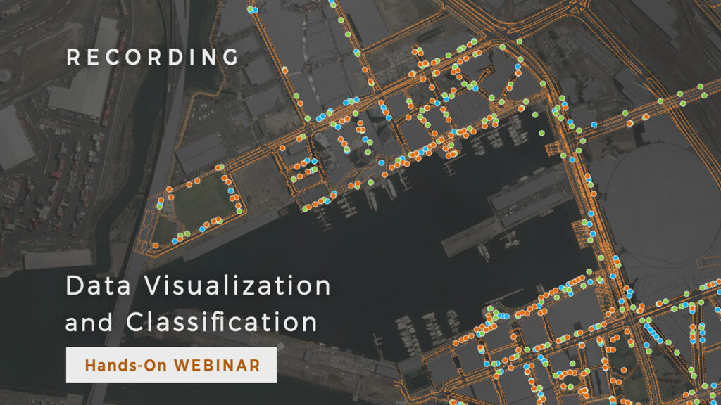
Last week you had a chance to join our step-by-step guided hands-on webinar, an excellent occasion for GIS novices as well as for experienced users to get some handy tips for data visualization.
In this session, we showed you how to create maps by uploading data, change symbology, classify data by attributes to make quick analysis, and other useful tips.
In case you missed the time slot, we prepared a recording for you! Fill in the form below.

Real-time mapping tools allow you to collect data with mobile devices in the field (even offline), or to upload them directly into GIS web application. After this initial step, our users need to make sense out of large amounts of data. To achieve this, you can use tools in Map Editor to efficiently and quickly visualize and classify your data.
To help you master GIS Cloud apps for data visualization and classification, we prepared a dataset for you to use (including addresses, streets, and buildings) while following our actions in Map Editor. You can download the dataset here.
In this webinar session you will learn how to:
- Upload data using drag & drop to create a map
- Change symbology to have a clear overview of the data
- Classify your data by attributes to make analysis
- Set-up zoom levels for different layers to optimize a map with a lot of data
- Use pop-up info windows
- Set-up labels
- Other neat visualization tricks
- Share your map and collaborate with others
To follow our instructions and try classification for yourself, you need to set up a free GIS Cloud account.
When you finish watching the webinar, don’t forget to make your maps public (as we suggested during the webinar), so we can see how you styled your maps!


