
Author: Marko Polovina, Frontend Developer at GIS Cloud
Spatial planning can be hard without a dashboard application where we can connect our map with filters, graphs and tables. Using GIS Cloud API in the Map Portal application we will show you how to create your custom dashboard and enable better data overview and spatial planning!
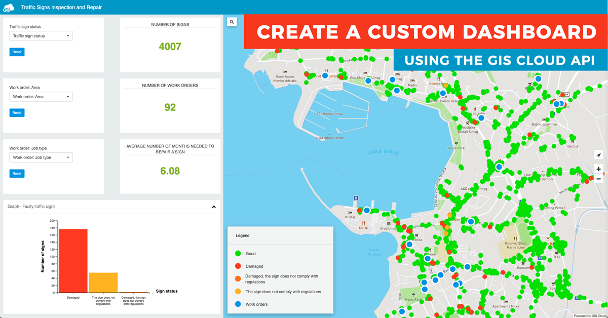
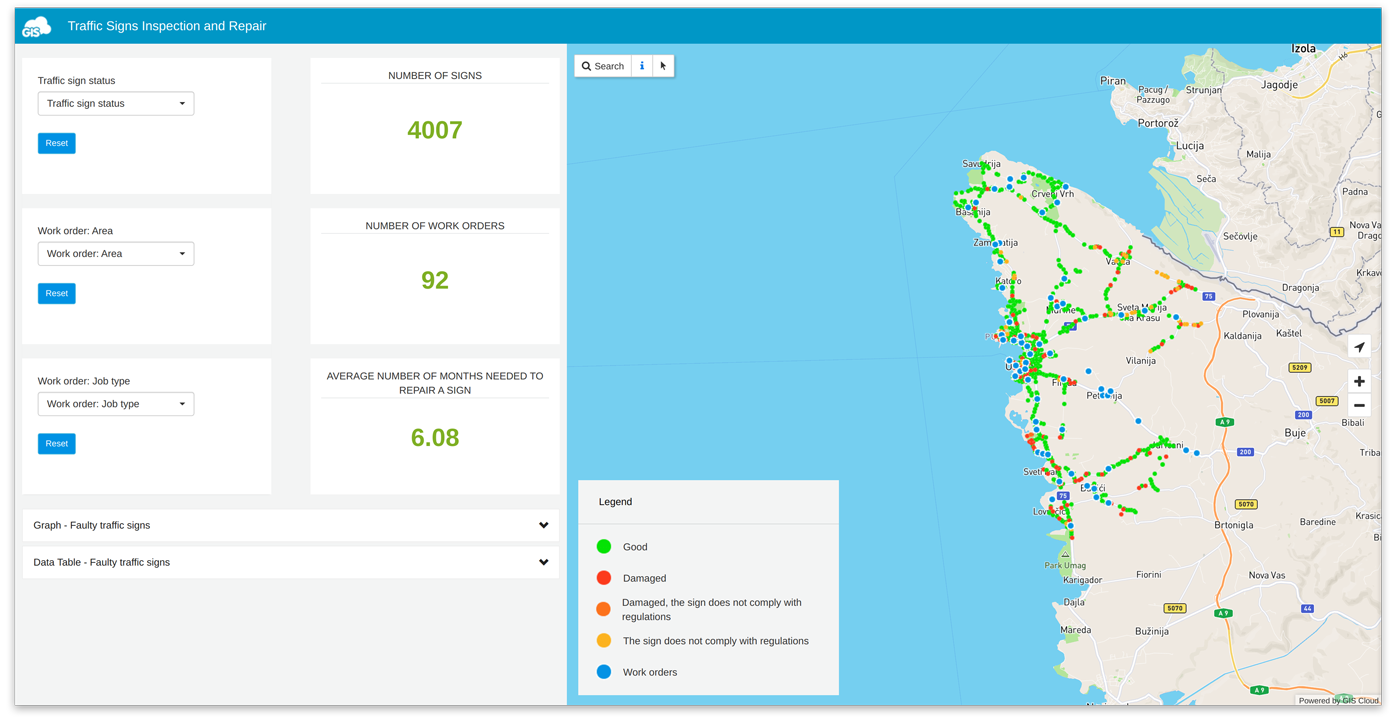
For our example, we created a custom dashboard to analyze traffic signs inspection and repair. Take a look at the final result: https://dashboard.giscloud.com/
What we wanted to get from our Dashboard application is a clear display of faulty traffic signs, what is the defect, and the average number of months needed to repair a sign. With that information, we can make informed decisions and optimize work processes.
Before we start, take a look at our developer’s site and GIS Cloud JavaScript API documentation.
How to start creating your custom dashboard
Create a list of components that you want to have in the dashboard and envision what you expect as the final result. Don’t be afraid to draw your dashboard, be creative!
In our example we decided to have 4 different components on the left side (filters, aggregate numbers, graph and table), map on the right, and a small custom legend. The final result is below.
Don’t put too much data in your dashboard, use clean design and make it usable. You can use your own HTML and CSS, just load those files in the Map Portal app and use them in your dashboard.
Now, set up your Map Portal app. To be able to do so, you will need to first upload data and create a map in GIS Cloud Map Editor. Then, go to the App builder application and build your map portal using created maps.
If you need additional instructions on how to create your own Map Portal take a look at this example or contact us directly.
When your Map Portal is up, your map is populated with data, and you are done with the initial portal customization and branding, it’s time to start coding.
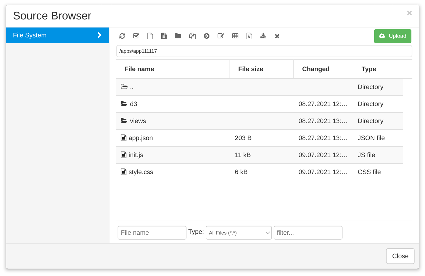
Add D3.js library to your Map Portal together with (for now empty) app.js, app.css and init.js files. Add an empty folder named ‘views’ where you can put your HTML files.
Go to GIS Cloud Manager and open the Apps tab from the Dashboard. Find your Map Portal from the Apps list, click on Edit, open the Advanced tab, scroll down and Open app folder. Upload your D3.js library to the Source Browser.
In the app.json file (which is created automatically once you have opened your portal in the App Builder and saved the changes), we can load all JavaScript and CSS files. Configuration for the dashboard is basic.
{
   "responsive": true,
   "scripts": {
       "namespace": "gc",
       "init": ["d3/d3.js", "init.js"],
       "setup": []
   },
   "styles": ["style.css"]
}
Filters
In the init.js file first create basic elements of the dashboard. Then load filters to, in our case, dashboard-left-content element. Every filter has a configuration where you can set layer id, filter type, column name, label, etc.
var filter = new giscloud.ui.LayerFilterForm($("#dashboard-left-content"), {
   filterDef: [
       {
           layer_id: config.signLayerId,
           items: [
               {
                   type: "DATA_FILTER_DROPDOWN",
                   column: "sign_status",
                   label: "Traffic sign status",
                   no_filter: "",
                   multiselect: true,
                   autofetch: true,
                   relevantValues: false,
                   items: [{ value: "", label: "" }],
               },
           ],
       },
       {
           layer_id: config.workLayerId,
           items: [
               {
                   type: "DATA_FILTER_DROPDOWN",
                   column: "area",
                   label: "Work order: Area",aggrega
                   no_filter: "",
                   multiselect: false,
                   autofetch: true,
                   relevantValues: false,
                   items: [{ value: "", label: "" }],
               },
           ],
       },
       {
           layer_id: config.workLayerId,
           items: [
               {
                   type: "DATA_FILTER_DROPDOWN",
                   column: "job_type",
                   label: "Work order: Job type",
                   no_filter: "",
                   multiselect: false,
                   autofetch: true,
                   relevantValues: false,
                   items: [{ value: "", label: "" }],
               },
           ],
       },
   ],
   gcdatagrid: window.gcdatagrid,
   viewer: giscloud.ui.map,
});
Aggregate numbers
In our example, traffic signs inspection and their repair, we wanted to know how long it takes to repair a sign. We decided to display that number in months, as the average value for all signs. In feature data there is a number month_reported and month_done. The difference between these two numbers will give us the number of months for one sign. At the end, we will count the average number by using all feature data.
var monthDiff,
   monthDiffSum = 0,
   counter = 0,
   monthDone,
   monthReported;

features.map(function (val, num) {
   if (val.data.month_done && val.data.month_reported) {
       monthDone = parseInt(val.data.month_done);
       monthReported = parseInt(val.data.month_reported);

       monthDiff =
           monthDone - monthReported > 0
               ? monthDone - monthReported
               : monthDone + 12 - monthReported;

       monthDiffSum = monthDiffSum + monthDiff;
       counter = counter + 1;
   }
});

$("#dashboard-right-content-panel-2 .loader").remove();
$("#dashboard-right-content-panel-2").append(
   "<div><p> " +
       (monthDiffSum / counter).toFixed(2) +
       "</p></div>",
);
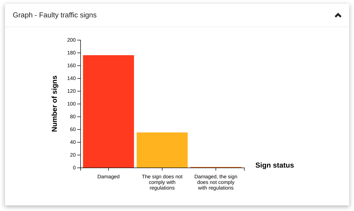
Graphs
For graphs we use D3.js. In our last developer blog post we talked about GIS Cloud and D3.js integration and how to create animated graphs combining two API’s. Our graphs example is available at https://graphs.giscloud.com/. Now we want to show you how easy it is to get all layer styles in one object and then use that object to paint D3.js graphs.
var groupStyle = {};
giscloud.ui.map.layersLoading.done(function (layers) {
   layers.map(function (layer) {
       if (layer.styles) {
           layer.styles.map(function (style) {
               if (!style.label) {
                   return;
               }
               groupStyle[style.label] = style;
           });
       }
   });
});
In the Editor app you can change the color of the layer by using color picker and writing HEX value. As a result, we have a color-rich graph that is easy to understand.
Table
To populate the custom table with data, we need to go through all the features by layer id and then append feature attributes in table columns. Since this table will be filled with faulty traffic signs, we don’t want a Good sign status.
giscloud.features
   .byLayer(config.signLayerId)
   .done(function (features) {
       features.map(function (val) {
           if (
               val.data.sign_status &&
               val.data.sign_status !== "Good"
           ) {
               $("#dashboard-accordion-two-collapse tr")
                   .last()
                   .data("feature", val)
                   .click(tableSelect)
                   .append(
                       "<td>" + val.data.sign_code ||
                           "" + "</td>",
                       "<td>" + val.data.sign_position ||
                           "" + "</td>",
                       "<td>" + val.data.sign_status ||
                           "" + "</td>",
                   );
           }
       });
   });
Table template is stored in the ‘views’ folder where you can upload your HTML files. Loading those files can be done in app.json file or in JS, like JQuery load method.
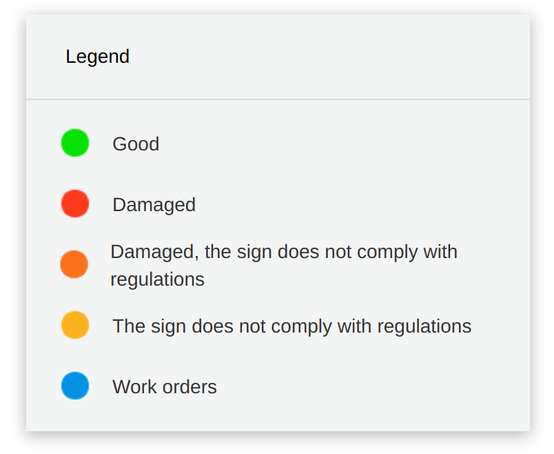
Legend
Using the same groupStyle object from the graph example, it is possible to create legend with icons in layer colors.
This will help users to better understand and analyze the data.
Final thoughts
In this blog post, we showed you how you can customize your Map Portal and build a feature-rich map dashboard that enables better spatial planning.
Using Map Portal you can develop any element and create your own product.
Find our custom dashboard example here.
Also, don’t hesitate to contact us if you have any questions, comments or maybe ideas for a new development example. And if you need any help with development, take a look at our new Services page.
Happy coding!