To show what GIS Cloud AI can do in one real, end-to-end workflow, we picked a task every road authority knows: a traffic sign inspection.
We ran the whole cycle with AI, in an hour or so, on a sample dataset and a live field record:
- Set up a data collection project (form connected to a layer on a map), via Claude, on a phone
- Collected a sign and its data in the field using AI Form fill
- Analyzed the results with Ask AI in Map Editor
- Built an analytics dashboard with AI App Builder
- Generated a custom branded PDF report, ready to print or send, from the Dashboard
No step required a GIS specialist.
We described in plain language what we wanted and confirmed the actions Claude or GIS Cloud AI proposed. In just over an hour, we completed the entire workflow.
What we ended up with:
- A Mobile Data Collection project with a 17-field inspection form, and a map styled by sign condition
- Field records filled in by AI from a photo and a voice description
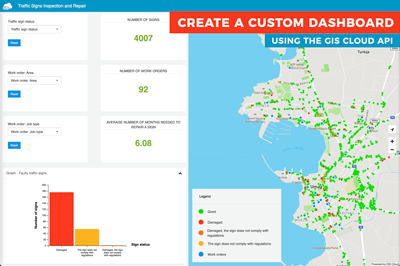
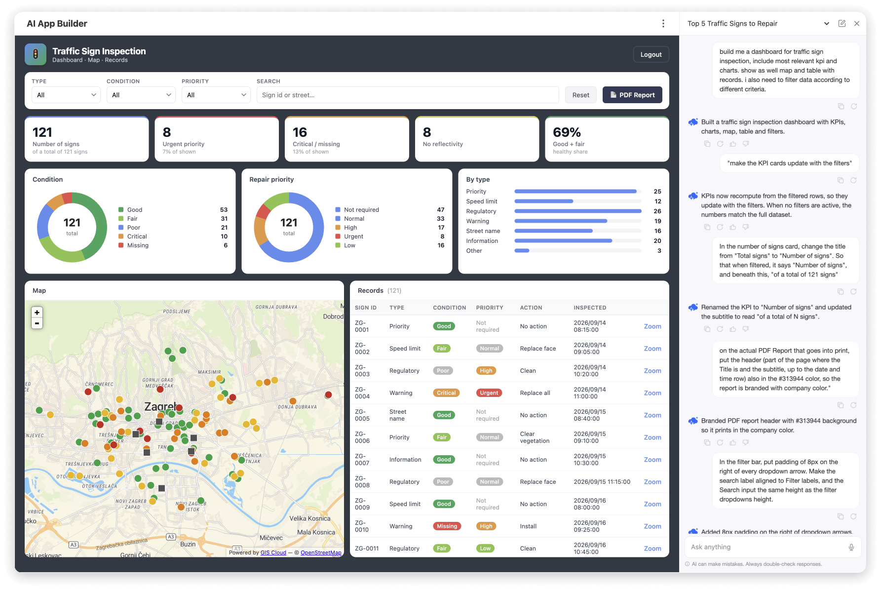
- A custom dashboard with KPIs, charts, a map, and a records table, all driven by filters
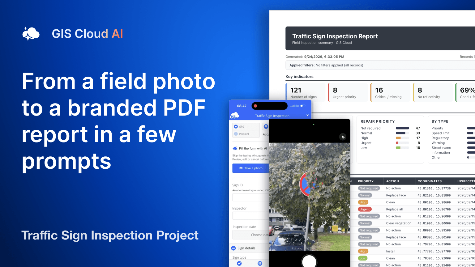
- A one-click branded PDF report of whatever you’ve filtered
What we used: Claude with the GIS Cloud connector, AI Form Fill in the Mobile Data Collection (MDC) app, Ask AI in Map Editor, and AI App Builder.
Here’s the workflow, with a video for each stage.
Step 1: Create the inspection project with AI in Claude
We opened Claude (on a mobile phone, in this case) with the GIS Cloud connector enabled and typed one line:
“Make me a MDC project for traffic sign inspection.”
Claude then did the setup work itself:
- created the map
- created a point layer with inspection columns, styled by condition (green to red, with a grey square for missing signs)
- built the mobile form
- bound all form fields to the layer columns
The classification was in place before we collected a single sign. Every record would land on the map already colored by condition.
The form covers:
- Identification: sign ID, inspector, and date
- Sign details: type, catalogue code, street and mounting
- Condition assessment: overall condition, damage checklist, reflectivity, obstruction and post condition
- Action: what’s needed, a priority from urgent to low, notes and photos
Conditional fields hide themselves. The damage checklist appears only for fair, poor, or critical signs, and priority appears only when an action is needed.
One detail shows how the connector handles changes. Claude spotted that its first version of the damage-checklist condition would also show for “good” signs. It queued a fix, explained it, and waited for us to reply “confirm” before applying it. Every modification of existing data goes through that confirmation step.
From the first prompt to a project ready in the MDC app took less than 2 minutes.
New to the connector? Connecting GIS Cloud to Claude or ChatGPT takes one click and a sign-in with your GIS Cloud account. There are no URLs to paste and nothing to configure. See how to connect.
Step 2: Collect data in the field with AI Form Fill
In the Mobile Data Collection app we opened the Traffic Sign Inspection project and tapped Take a photo. We deliberately picked a hard case: a round blue mandatory sign half-hidden behind tree branches.
AI Form Fill filled in the form and gave every value a confidence score:
- High confidence: visibility obstructed (95%), action required “Clear vegetation” (90%), mounting (80%)
- Lower confidence: overall condition (40%) and priority (55%)
It also wrote the inspection note itself. The note describes a round blue mandatory sign, most likely “keep right”, largely hidden behind branches and unreadable to drivers, with vegetation clearing needed.
Lower-confidence values are highlighted in a different color, so the inspector knows exactly where to look.
A photo can’t tell you everything, so next we tapped Describe and spoke the rest: the sign’s ID, the inspector’s name and the inspection date. The video has no sound, but you can see those fields fill in, each with its own confidence score.
After the first input, the section changes to Improve AI suggestions. Every new photo or recording adds to what’s already there instead of overwriting it.
We reviewed the values and tapped Send. Moments later, the sign appeared on the map, colored by its condition. Tapping it opens Feature details with everything that reached the cloud: action, condition, inspector, mounting, the AI-written note, and the photo.
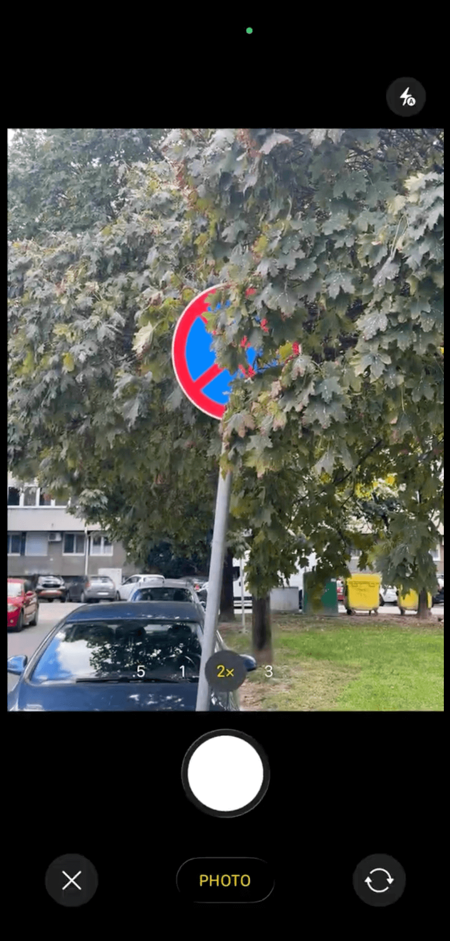
A second sign, same result. AI identified a No Stopping sign behind foliage and suggested trimming the vegetation to restore visibility.
Why this matters: the inspector’s job shifts from typing every field to checking what AI suggests. The human reviews and confirms.
Step 3: Ask which signs to fix first, in Map Editor
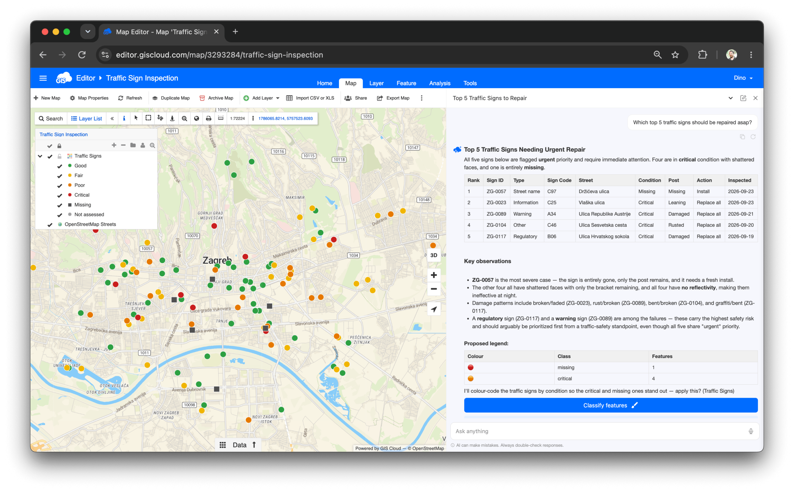
Back at the desk, we opened the map in Map Editor. The signs were already on the map, colored by condition from Step 1: good, fair, poor, critical, missing, and not assessed.
We started a new conversation with Ask AI, the assistant built into GIS Cloud, and asked one question:
“Which top 5 traffic signs should be repaired asap?”
Ask AI queried the layer and returned a ranked table. For each sign it listed the ID, type, sign code, street, condition, post condition, required action and inspection date. All five were flagged urgent: four in critical condition with shattered faces, and one missing entirely, with only the post left.
It then added observations a maintenance lead would actually use:
- All four damaged signs have no reflectivity, which makes them ineffective at night.
- The damage patterns differ from sign to sign.
- A regulatory sign and a warning sign are among the five, and those carry the highest safety risk.
On that basis, it suggested the two arguably go first, even though all five share the same priority.
Finally, it proposed a classification that makes the critical and missing signs stand out on the map, and asked whether to apply it. Nothing changes until you click Classify features. We left the map as it was: the answer was what we needed, and the proposal stays a proposal until you decide otherwise.
Step 4: Create a new app and pick up the conversation
The maintenance manager doesn’t need a GIS map. They need a dashboard.
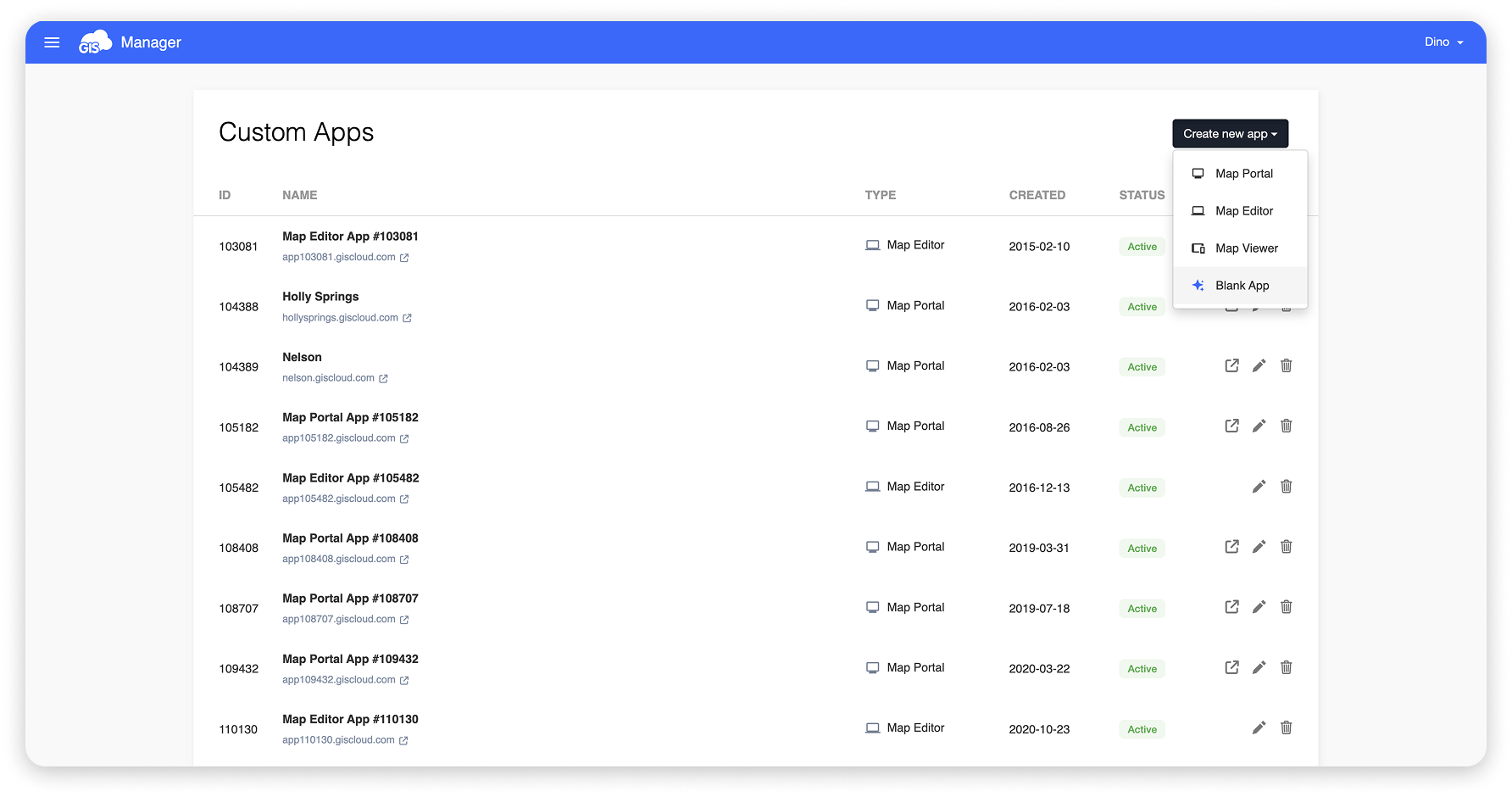
In Manager, we clicked Create new app and chose Blank App. Clicking its icon opens the app in AI App Builder. This is one of the few manual clicks in the whole workflow.
When AI App Builder opens, Ask AI offers two things below the input and suggestions:
- Conversations from other GIS Cloud apps (Map Editor, MDC Portal..), active in the last 24 hours.
- The option to start a new conversation.
We picked the “Top 5 Traffic Signs to Repair” conversation from Map Editor. Ask AI conversations follow you across GIS Cloud apps, so the AI already knew which map and which signs we were talking about, and we didn’t have to explain anything twice.
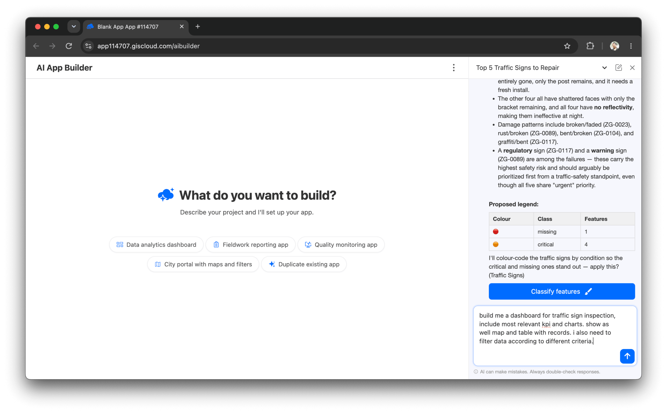
The Ask AI conversation from Map Editor continues in AI App Builder.
Step 5: Build the dashboard and the branded report with AI App Builder
The first prompt was deliberately loose:
“Build me a dashboard for traffic sign inspection, include most relevant KPIs and charts. Show as well map and table with records. I also need to filter data according to different criteria.”
AI App Builder returned a complete dashboard:
- KPI cards: number of signs, urgent priority, critical or missing, no reflectivity, and the healthy share
- Charts: condition and repair priority donuts, plus a breakdown by sign type
- Map and table: a map of every sign and a records table with a Zoom action on each row
- Filters: type, condition, priority and a search box
A few follow-up prompts shaped it into something we’d hand to a client.
First, filters that drive the map. One line (“when using filters also filter on the map”) and the map now shows only the signs matching the filters, in sync with the table and charts.
Then KPIs that follow the filters. With one prompt, the KPI cards recalculate from the filtered records. We also renamed “Total signs” to “Number of signs” with “of a total of 121 signs” underneath, so a filtered view always shows its context.
Next, we added a report button and company colors:
“Put a ‘PDF Report’ button to the right of the Reset button, in dark grey, that creates a branded report of whatever is currently filtered. Make the app background the same dark grey, as well as the header buttons, and make any text sitting directly on the background white.”
And branding on the printed page:
“On the actual PDF report that goes to print, put the header, the title and subtitle, in the same dark grey, so the report is branded with the company color.”
A couple more rounds took care of the details:
- readable labels instead of raw field values
- the required action shown for every sign
- each sign’s coordinates added to the printed report, so a crew can find it
Step 6: Filter, click, send
This is the part usually done by hand at the end of every inspection round: turning data into something you can put in front of a director, a council, or a contractor.
In the dashboard, set the filters to what matters, for example, all regulatory signs in poor condition. Then click PDF Report.
The app generates a report with:
- the branded header
- the generation timestamp
- the filters that were applied
- the key indicators
- breakdowns by condition, repair priority, and sign type
- a records table with each sign’s required action and coordinates
Save it as a PDF, and it’s ready to print or send.
Because the dashboard is a shareable app, not a one-off chat answer, anyone on the team can open it, set their own filters, and pull their own report whenever they need it.
Try the result: open the live dashboard, filter it, and download a branded PDF report yourself.
Why you can trust the result
AI chose the approach and orchestrated it, but it never held the data or did the math.
Queries and GIS operations ran on GIS Cloud’s deterministic tools, which have been in production for years. Our rule: the model must not know geography; it must ask for it.
That makes every step checkable:
- Tool calls are visible, with their parameters.
- Results are real layers, tables and apps in GIS Cloud, not text in a chat.
- Changes to existing data need your confirmation, as in Steps 1 and 3.
- Every AI-filled field value carries a confidence score.
- You can take over manually at any point.
Read more about our security and data handling and ISO 27001 certification.
Three people, three interfaces, one dataset
The same data was touched in three places: by whoever set up the project in Claude, by the inspector in the field app, and by the maintenance manager in the Editor app, in the dashboard and PDF report.
None of them needed a GIS specialist in between.
FAQ
Can AI fill in a traffic sign inspection form, from a photo? Yes. In the GIS Cloud MDC app, AI Form Fill reads the sign type, condition, obstruction, and required action from a photo, and adds anything you say into the phone. Every value comes with a confidence score, and the inspector reviews everything before sending.
Do I need GIS experience to build an inspection dashboard? No. In AI App Builder, you describe the dashboard in plain language: KPIs, charts, map, table, and filters. You then refine it through conversation. GIS Cloud hosts the app, which can be shared with a link.
Can the dashboard produce branded PDF reports? Yes. In this example, one prompt added a PDF Report button that turns the filtered records into a report in company colors, with key indicators, breakdowns, and a records table.
Does the AI change my data without asking? No. Changes to existing data, such as the form fix in Step 1 or a map classification in Step 3, are proposed first and applied only after you confirm.
Try it yourself
- Try the result: [open the live dashboard][LINK: L17], filter it and download a branded PDF report
- Go deeper: GIS Cloud AI: The Complete Guide
- Connect your AI: How to connect GIS Cloud to Claude or ChatGPT
- Start building: Start free or log in and open AI App Builder from Manager
- Talk to us: Book a demo, and we’ll run this workflow on your own data
GIS Cloud AI has been live since July 1, 2026. Read the launch post. GIS Cloud is available in Claude’s Connector Directory and as the first official GIS plugin in ChatGPT.